Airbnb Case Study
Hello! Today I want to tell you how we created experiences from test to product teams. The task sounded something like this:

Design a feature for Airbnb, allowing a group of friends to plan and book their mutual vacation.
So, we started working on the task, which eventually resulted in a new app.
Desk Research
Initially, we started with desk research in order to get the maximum amount of information out of the Internet. We looked at analogs (of which we selected Benchmarket and competitors, and from competitors direct and indirect). After spending some time on the Internet and on Google Play, we found what we looked for.
Direct:
Booking.com, Airbnb, OneTwoTrip, Trivago, HomeToGo, Tripadvisor.
Indirect:
Summer cottage, new game releases, serials, pandemic.
If with the direct ones everything is more or less clear (which features to borrow, etc.), then with the indirect ones everything is not so simple. We asked ourselves the following questions: Why do people prefer summer cottages to travel? How exactly can the announcement of new episodes of your favorite TV series influence the decision to stay at home? Why?
In general, during the collection of information, a lot of hypotheses appeared, which we wrote down in a notebook in order to verify them during the interview.
Benchmarkers:
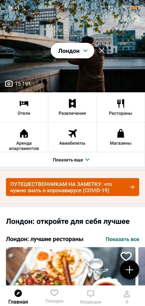
Tripadvisor (Planning a Trip), Aviasales (Home), Airbnb (Experiences). We were pleasantly surprised that a similar function has already been implemented in one of the apps, except that only the creator of the trip sees this trip.
Statistic
In it, we looked at search queries in search engines, the geography of flights, travel spending, frequency of trips, etc.
A lot of information has accumulated, which we have placed in a separate Word document.
Basically, it was information about age, financial condition, number of trips per year, and how many people were collected in a maximum of one trip.
Interview
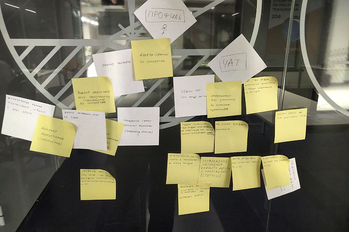
We interviewed about 30 people and identified the main pains of users: People cannot cope with organizing a trip on their own, it is difficult to negotiate, do not match the required dates, no one wants to be an organizer, most people have different preferences: someone loves a quiet, beach holiday, someone loves to hang out at night, go to bars, extreme trips. We wrote down all the insights on stickers and pasted them on the wall.
In addition, many, given their different interests, did not want to separate, but there was a part that talked about their negative experiences of traveling with people with disabilities.
POV
After the conducted research, we focused on defining the problem and settled on this POV:
How can we help Petya to organize joint trips so that everyone likes it using a mobile application “, then User Story would sound like this -” Like Petya, I want to organize joint trips with friends so that everyone is happy. “Petya — person, travel organization — story, mobile application (screens) — script.
In fact, it all fit into one paragraph here, we worked on the POV data for about two days:).

Prototype
By the beginning of the second stage, we already knew the main hypothesis and had a clear problem. To solve it, we started brainstorming and throwing ideas, after presenting our ideas to the team, we reduced them to a real workable amount.
We selected ideas for the following categories:
- Complexity of implementation
- Solving the main problem
- Number of people who voted for the idea
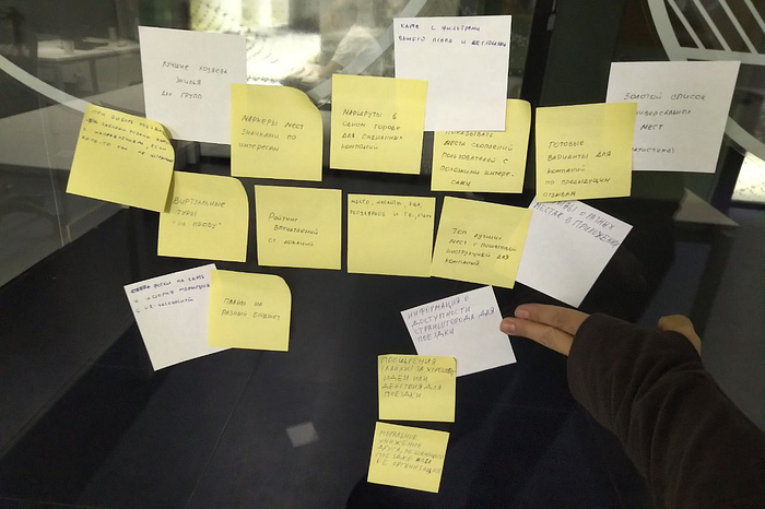
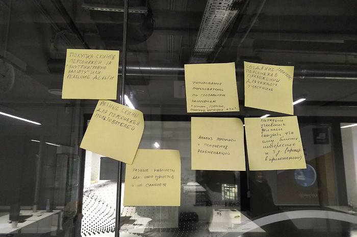
There were a lot of them: from gamification of the process of creating a trip plan to creating a super-app with its own financial architecture.
Here is a small list of ideas that we stopped at an archive of trips with saved travel maps, taking into account the interests of all users and building a route with everyone, a feed of impressions from public plans, the ability to integrate plans and search for travel companions, etc.


As smart people say, good ideas are nothing; good ideas still need to be well implemented.
With that in mind, we got down to my favorite part — prototyping. On the good, they need to be drawn in the course of checking and selecting ideas, but we went the other way. We already knew exactly what problems and pains of users the product had to solve and understood the work that it had to do. In any case, we did not deny the ideas that the users suggested, under a clear analysis we decided whether they would be included in the final product or not.
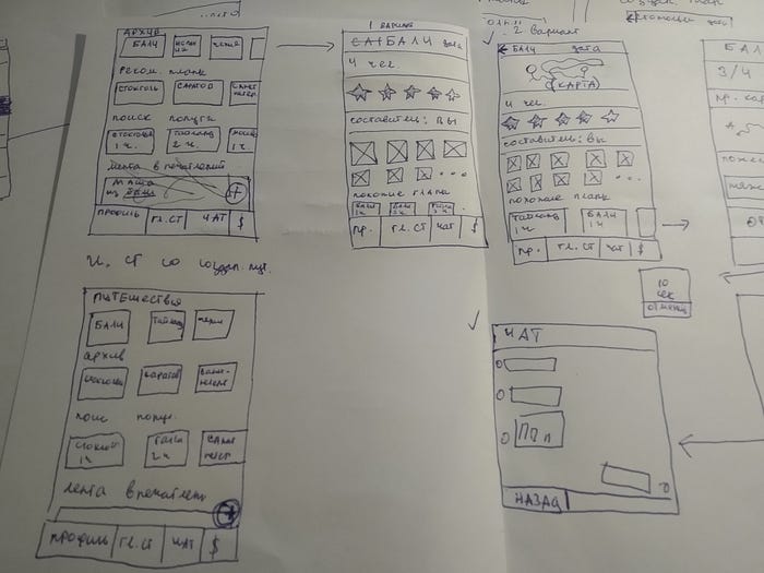

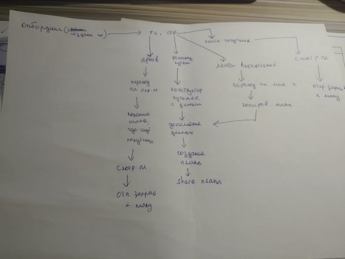
Basically, we drew by hand, created interactive in Marvel and went to test
After several iterations of working with the prototype, our version still has problems, namely: improve communication with the help of text, change the user flow when switching to the photo feed (people expected it to work the same way as Instagram, which is logical), elaboration of information, which is displayed on the user’s screen.
Final
There was little left to do, we had well-developed prototypes in our hands, and in our heads, there were problems that we had to solve. Taking this into account, we added visuals in Figma and this is what came of it.
There was little time to implement the layouts, but we still have a couple of screens that we want to show.


